• Tutorial: CSS
Understanding Margin Collapse
There are two quirky scenarios where CSS margins do not behave the way you would expect them to. Being aware of them will go a long way to helping you avoid a big and unnecessary headache.
Sibling Rivalry
The first problem occurs when sibling elements have vertical margins facing one another.
The Example
<div class="upper">
    ...
</div>
<div class="lower">
    ...
</div>
.upper {
margin-bottom: 30px;
}
.upper {
margin-top: 50px;
}In this case, you'd probably expect that margins to combine resulting in 80px of space between them, but unfortunately you'd be wrong.

30px + 50px = 80pxThe smaller margin gets consumed by the larger. So rude, right? The space between them ends up being 50px, not 80px.

30px + 50px = 50pxThe same rule applies when both margins are negative; the greater margin absorbs the lesser.
(-30px) + (-50px) = -50pxWhen both margins are the same. One is used, while the other is absorbed.
30px + 30px = 30pxWhen one is negative and the other is positive; the negative margin is taken from the positive.
(-30px) + 50px = 20pxThe Solution
How do you fix it? Short answer, you don't. The only way to "fix" this problem is to avoid it. I recommend applying margins (for vertical spacing) exclusively to the top or the bottom of your containers (I prefer the bottom). This way, you will never have margins meeting and risking a collapse. Life is so much easier when siblings aren't fighting.
Child Abuse
This next problem occurs when the margin of a child meets the margin of its parent.
The Example
<div class="parent">
    <div class="child">
        ...
    </div>
</div>
.parent {
    margin: 15px 0;
}
.child {
    margin: 10px 0;
}
In this case, you would probably think that the total margin would be the sum of both the parent and the child's margins, and again, you'd be wrong.

15px + 10px = 25pxThe margin of the parent always overrules the margin of the child. This is the case even if the parent's margin is smaller than the child's. Pretty, harsh discipline if you ask me.
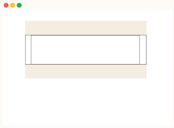
15px + 10px = 15pxThe Solution
There is a very simple remedy to this problem; As long as there is a "solid" object between the two competing margins, they will both be applied. Simply add an element, a border or even just 1px of padding and the child's margin will remain.
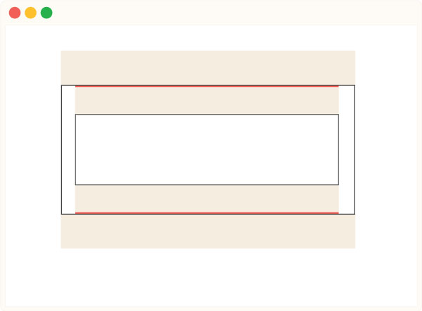
.parent {
    padding: 1px 0;
}
Another great solution is to add a pseudo element to the top and bottom of the container via CSS. Nicolas Gallagher combined this approach with the solution for fixing floats. So, the next time you run into either issue, all you have to do is add a class to the parent and you are good to go!
.clearfix:before,
.clearfix:after {
    content: '';
    display: table;
}
.clearfix:after {
    clear: both;
}
Other Resources
Here is another great guide on this topic from CSS Tricks.

